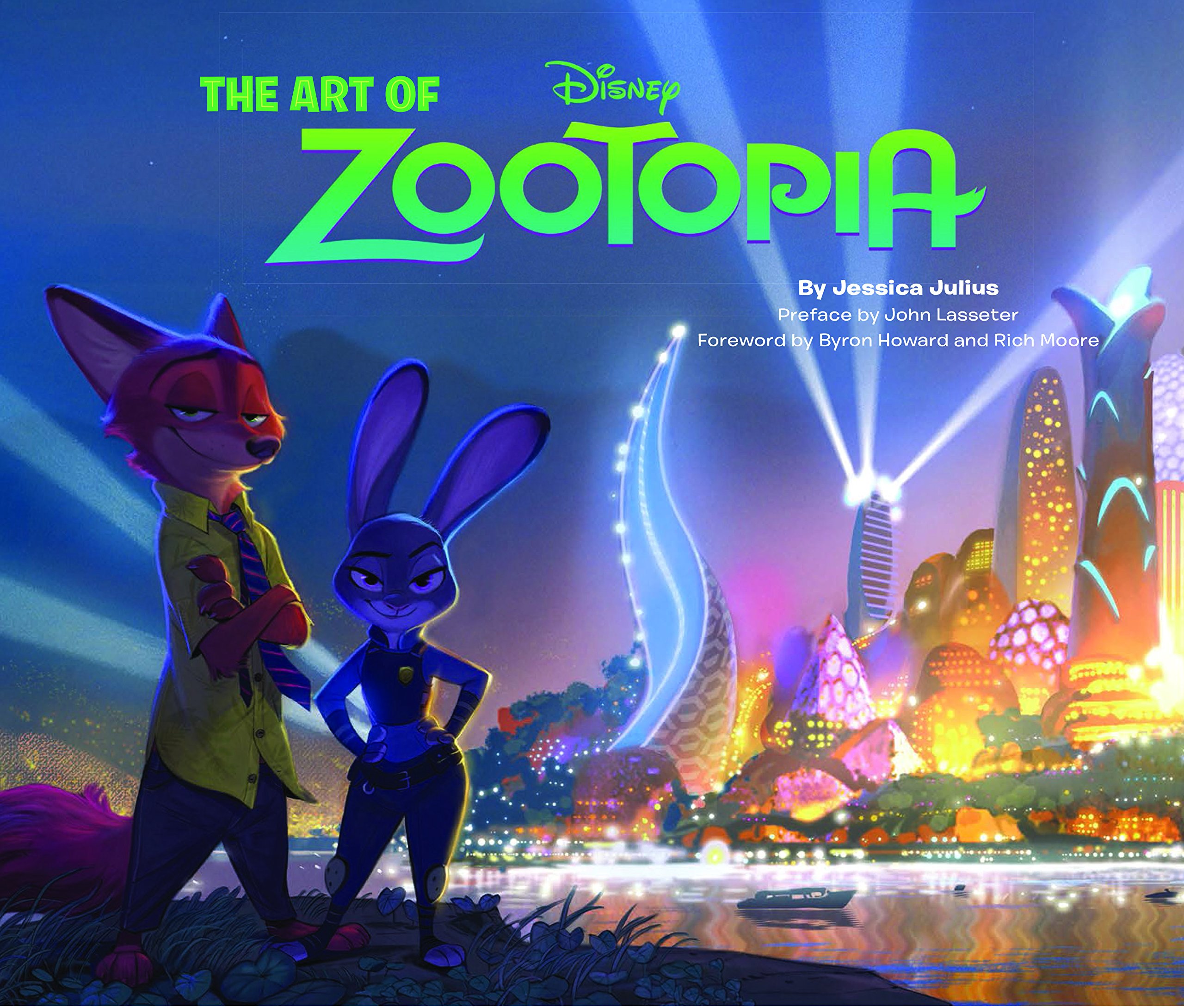
Hey everybody! It’s your Meerkat of Merch, Surrika! I’m back, with another book to review- that book being the Art of Zootopia, by Jessica Julius.
There is a lot to cover in this book and a lot to enjoy but I’m just going to wet your appetite with what you will find within the pages of this huge book! Not only that, but I’m going to focus on some of the stuff the fandom hasn’t really “used”, per say.
But first, before you click for the break. Yes, you should buy this book. It is excellent!
Now with that out of the way lets get this review train a-rollin’ after the break!
The book is filled with interesting little tidbits, but I don’t want to ruin the entire book because I want to leave something for you guys and gals to read!
The first part of the book goes into creation of Zootopia and the many forms of different movies it could’ve been, such as the 3 Musketeers, Doctor Meow and Pug the Bounty Hunter. They did away with those concepts to bring us the movie we all know and love.
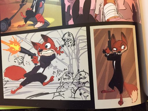
The first concept designs of a familiar character we see is Nick. But not how we ever see him in the movie. No sir, this Nick is looking snazzy as heck. In fact in one of the pictures he seems to change into a white bunny with black stripes, No clue what that’s about. It’s very interesting to see Nick looking like a secret agent of sorts.
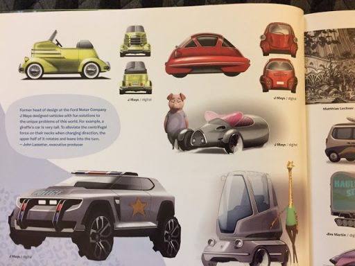
The book also delves into quite a bit of detail in how they conceptualize the world design and how they lived in it, from the residential housing they live in right down to the cars they drive. Speaking of which, they actually brought in the former head of design of the Ford motor company, J Mays to help with the designs of the vehicles. I can only imagine the look on his face when the suits came up to him and said “Help us design a car for rodents”.
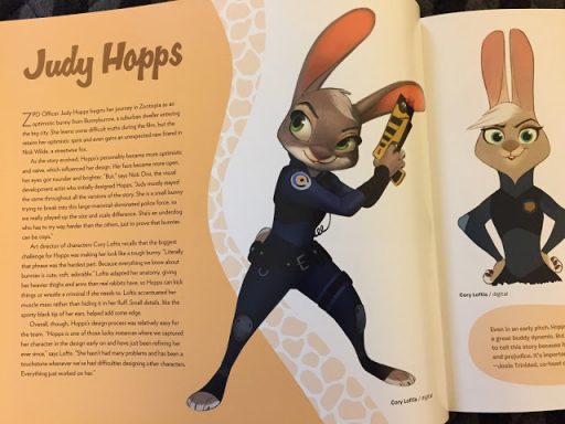
The first character we see a full spread page of is of course the star of the show, Judy Hopps! It shows all the various design changes she went through just as the massive tuft of white hair she used to have at the top of her head, which I am kind of glad they did away with because it makes her look kind of old but you can tell they had fun drawing her. There’s even concept art for Judy as a Zombie (Which I am not going to spoil)!
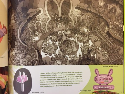
We get to see a lot of her home that didn’t make it into the film, which is a crying shame because some of the conceptual art for the original visions of Bunnyburrow are gorgeous. A seemingly chaotic, but in actually well-oiled machine of bustling bunny activity which would of looked amazing brought to life on the big screen. Bunnyburrow was almost non-existent in the movie compared to what they deleted to the point we only see the barnyard fair and a little market stall they sell their goods at.
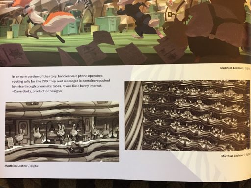
Speaking of bunnies, this book revealed that there used to be rabbits that served in the ZPD- but not in the way Judy wants to serve. Originally Bunnies served as operators that were in walls like a giant switchboard network. I found this concept (forgive me Judy) cute as heck, and would’ve loved to have seen it in fully animated glory! I rarely see this mentioned in the fandom but would love to see fans do something with this. Maybe an AU where Judy serves as an operator first and has to work her way up the ladder?
There is a lot of deleted characters and locales also revealed in this book including locations we don’t see a whole lot of such as Meadowlands, Palm Springs hotel & casino and the elementary school we have seen in deleted scenes. They also touch on deleted characters that would of been touched on in those locales such as Nicks dad, Koslov the polar bear, his son Morris and Honey Badger the…Honey Badger. Wow, cruel parents.
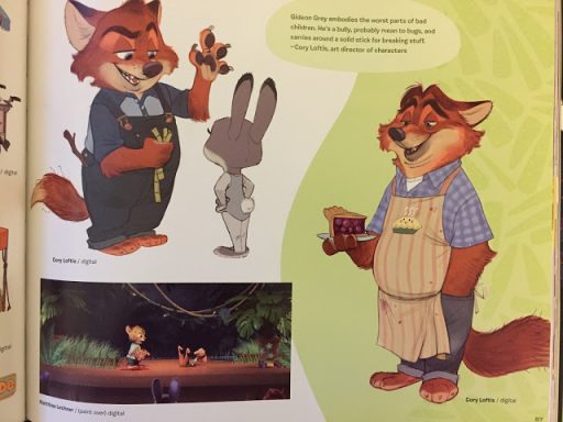
Now this bit is more a personal. Note that I have brought up in previous reviews is there is absolutely no Gideon Grey merch whatsoever, and whilst this book does touch on him it is for a very small amount (which is disappointing because I would’ve loved to have seen his concept designs from bullying Gid to happy with himself reformed giddy Gid). Oh well, at least he got something I suppose.
Like I said at the start of the review:
Get this book! It is chocked full of interesting things that I didn’t even touch on because I didn’t want to ruin every single surprise this book has to offer.
A big thank you goes to DrummerMax for helping me get the pictures. His artbook is in much better shape than mine. I’ve read mine a bit too much ha! (His also says Zootopia instead of Zootropolis.)
This has been Surrika, your friendly neighbourhood meerkat! See you guys in the next review!

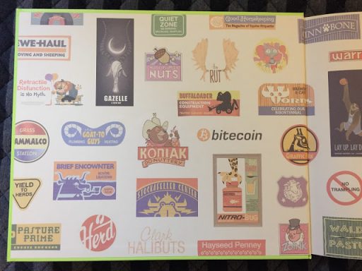

A Delightful book to be sure and the only coffee-table book I've ever bothered to by new.
Awesome Review my friend! Keep up the good work! 🙂
No Zootopia collection is ever going to be complete without the "Art of" book. Certainly hoping some of the original concepts (like the Hopps house) come back if a sequel is ever made.
As I said to you on Telegram, if I didn't already own a copy this review would easily have convinced me to buy one. Great work ^^
I just finished reading "Water Under The Burrows", and the creative team on that used the Hopps residence from this book. What a treat to see the original source material!
Comics are good and funny, I like reading comics
vex 3